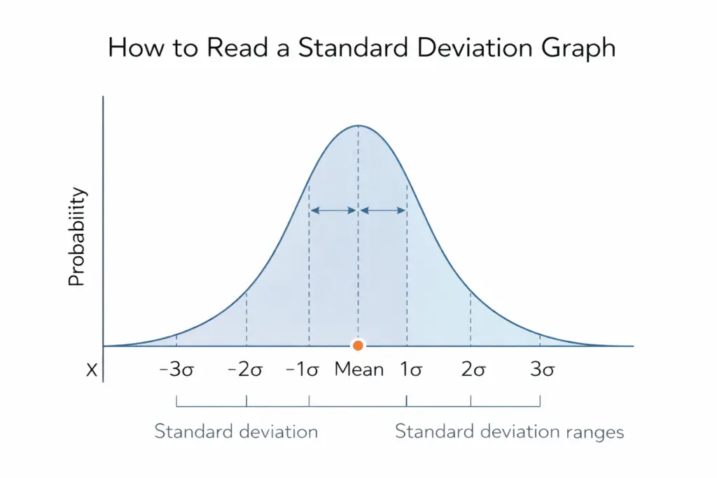
A standard deviation graph is a powerful visual tool used to understand how data is spread around the mean. Instead of looking at numbers alone, a standard deviation graph or standard deviation chart helps you see patterns, variability, and consistency within a data set. That is why these graphs turn up in lab reports, classrooms and financial charts.
When people look at a graph, one common question is how to tell whether the data has a larger or smaller standard deviation. On a graph, larger standard deviation means the data is more spread out from the mean, while a smaller standard deviation means the values are closer together. Learning how to read this visually is much easier than relying only on formulas.
Then, you will see how standard deviation appears on a graph, how to compare graphs, and how to identify larger standard deviation just by looking at the shape and spread of the data.
Table of Contents
What Is Standard Deviation
Standard deviation is a statistical measure that shows how spread out the values in a data set are. It tells you how far the numbers are from the mean on average. If the values are close to the mean, the standard deviation is small. If the values are far from the mean, the standard deviation is large.
Definition of Standard Deviation
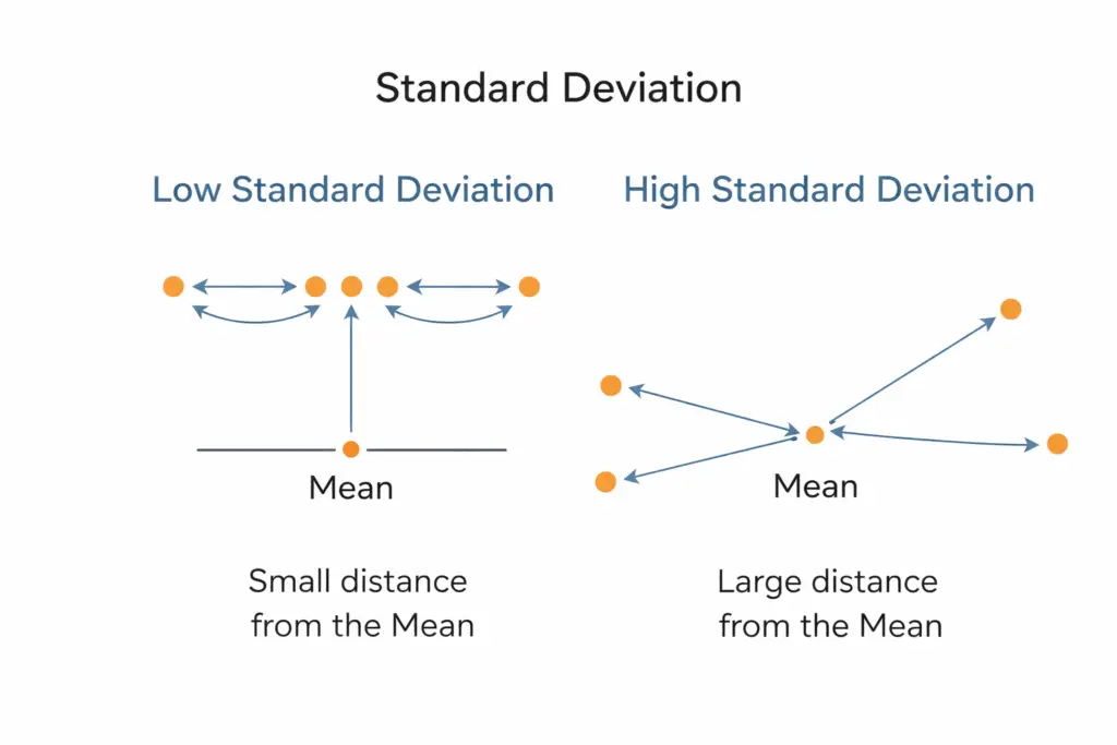
In statistics, standard deviation is defined as the average distance of each data value from the mean of the data set. This definition helps explain why standard deviation is used to measure variability or consistency in data.
Why Standard Deviation Is Important
Standard deviation helps you understand whether data values are tightly grouped or widely spread. Two data sets can have the same mean but very different standard deviations. So the mean alone will not tell you how consistent the data is.
Simple Step by Step Explanation
To understand standard deviation conceptually, follow these basic steps:
- Calculate the mean of the data set
- Subtract the mean from each data value
- Square each difference
- Find the average of those squared differences
- Take the square root of that average
These steps explain how standard deviation measures the spread of data around the mean. You do not always need to calculate it manually, but knowing these steps helps you understand what the graph represents.
Low vs High Standard Deviation
- Low standard deviation: Data values are close to the mean and show consistency
- High standard deviation: Data values are spread out and show more variability
When you view a standard deviation graph, these differences appear visually as narrow or wide curves. Now that you understand what standard deviation is, the next step is to see how this concept appears in a graph.
What Is a Standard Deviation Graph
A standard deviation graph is a visual representation that shows how data values are spread around the mean. A graph shows the spread of a data set without reading every number. It is commonly used to compare how consistent or scattered different data sets are.
A standard deviation graph is often displayed as a bell-shaped curve when the data follows a normal distribution. In some cases, it may also appear as a standard deviation chart with bars or lines showing the spread of data. Both formats help explain the standard deviation of a graph clearly and visually.
What a Standard Deviation Graph Shows
A standard deviation graph helps you understand:
- Where the mean is located
- How far data points spread from the mean
- Whether the data has low or high variability
- How consistent the data values are
This makes standard deviation graphing especially useful in statistics, research, and performance analysis.
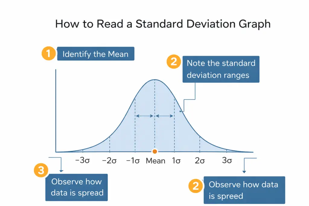
Standard Deviation Graph vs Standard Deviation Chart
Although the terms are often used interchangeably, there is a slight difference:
- A standard deviation graph usually refers to a continuous curve, such as a bell curve
- A standard deviation chart may use bars, error bars, or line charts to display variation
Both formats represent the same idea and help you read standard deviation visually.
Why Standard Deviation Graphs Matter
Standard deviation graphs make it easier to compare data sets. Two graphs may have the same mean, but the one with a wider spread shows a larger standard deviation. This visual comparison is much faster than reading raw numbers. Understanding what a standard deviation graph is will help you read and interpret its shape, which is the next important step.
Understanding the Shape of a Standard Deviation Graph
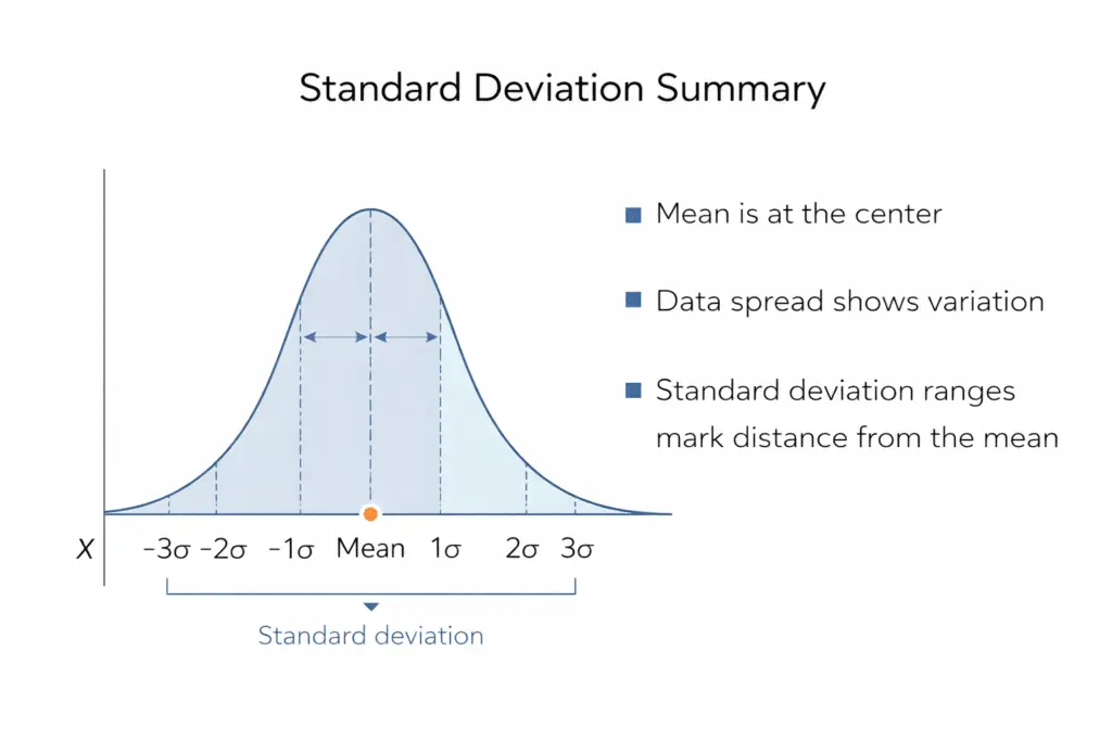
The shape of a standard deviation graph tells you how data values are distributed around the mean. Most standard deviation graphs follow a normal distribution, which creates a bell-shaped curve. This shape helps you quickly understand whether the data is tightly grouped or widely spread. To put numbers on that spread, the normal distribution calculator returns the exact area under any section of the curve.
The Bell Curve Explained
In a normal distribution:
- The highest point of the curve represents the mean
- Values close to the mean form the center of the curve
- Values farther from the mean appear in the tails
The width of that curve is the standard deviation.
How Spread Affects the Graph Shape
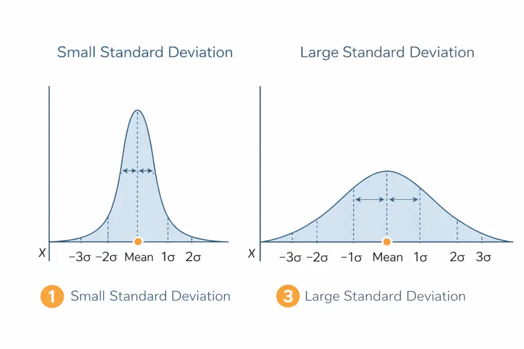
The width of the curve shows the level of variability:
- A narrow and tall curve means a small standard deviation
- A wide and flat curve means a large standard deviation
Step by Step: Reading the Shape
Follow these steps when viewing a standard deviation graph:
- Locate the center of the graph to find the mean
- Observe how quickly the curve drops on both sides
- Check how far the data spreads from the center
- Compare the width of the curve with other graphs
Using these steps helps you understand whether the data has high or low variability just by looking at the shape.
On a Graph, How to See Larger Standard Deviation
To tell which of two graphs has the larger standard deviation, look at the width of the curve. The answer becomes clear when you know what visual signs to look for. A standard deviation graph with a larger spread shows greater variability in the data.
Key Visual Signs of Larger Standard Deviation
You can identify larger standard deviation by observing these features:
- The graph appears wider across the horizontal axis
- Data points are farther away from the mean
- The curve looks flatter rather than tall
- The tails of the graph extend further outward
These features show that the values are more spread out.
Step by Step Method to Compare Graphs
Use this simple method when comparing two standard deviation graphs:
- Find the mean on each graph
- Look at how far the data extends from the mean
- Compare the width of both graphs
- Identify which graph has values spread further
The graph with the wider spread has the larger standard deviation.
Example Explanation
If two graphs have the same mean, the one with a wider and flatter curve represents data with more variation. This means the standard deviation of that graph is larger. A narrower curve indicates data values are closer to the mean and have a smaller standard deviation.
Understanding this visual difference makes standard deviation graphing much easier and faster.
How to Read Values on a Standard Deviation Graph
Reading values on a standard deviation graph helps you understand how much data falls within certain ranges. These ranges are based on standard deviation units measured from the mean. Most standard deviation graphs follow a normal distribution, which makes interpretation easier.
Finding the Mean on the Graph
The mean is usually located at the center of the graph. It is the highest point of the curve in a standard deviation graph. All measurements of spread are taken relative to this point.
Understanding Standard Deviation Ranges
A standard deviation graph is divided into sections that show how data spreads from the mean:
- Within one standard deviation: Most values are close to the mean
- Within two standard deviations: A larger portion of the data is included
- Within three standard deviations: Almost all data values are covered
These sections help explain how the data is distributed across the graph.
Step by Step: Reading Data from the Graph
Follow these steps to read values correctly:
- Locate the mean at the center
- Identify the scale on the horizontal axis
- Measure the distance from the mean to one standard deviation
- Observe how data points fall within each range
This method helps you understand the standard deviation of a graph without calculating every value manually.
Why These Ranges Matter
These ranges allow you to estimate how common or rare certain values are. Data closer to the mean is more frequent, while data farther from the mean is less common. This makes standard deviation charts very useful for data analysis and comparison.
How to Calculate Standard Deviation from a Normal Distribution Graph
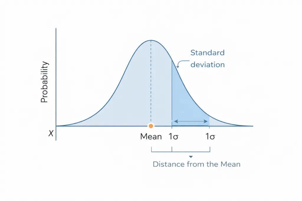
In some cases, you may not have the original data values but only a normal distribution graph. You can still estimate the standard deviation by carefully reading the graph. This method is useful when working with charts, reports, or published research.
Understanding the Graph Scale
Before calculating standard deviation from a graph, check the scale on the horizontal axis. The numbers on this axis represent actual data values. The mean is located at the center of the graph.
Step by Step Method
Follow these steps to calculate standard deviation from a normal distribution graph:
- Locate the mean at the center of the curve
- Identify the point where the curve changes shape noticeably on one side
- Read the value at that point on the horizontal axis
- Subtract the mean from that value
The result gives an estimate of one standard deviation.
Using the Standard Deviation Rule
In a normal distribution:
- Most data falls close to the mean
- The curve bends noticeably at about one standard deviation from the mean
By observing where the curve starts to slope downward more sharply, you can estimate the standard deviation visually.
When This Method Works Best
This method works best when:
- The graph clearly follows a normal distribution
- The scale is evenly spaced
- The mean is clearly marked
If exact precision is needed, calculating standard deviation from raw data is more accurate. However, reading it off the graph is fine for a quick estimate.
How to Graph Standard Deviation Step by Step
Creating a standard deviation graph helps you visualize how data is distributed around the mean. This process involves calculating key values and then plotting them correctly on a graph.
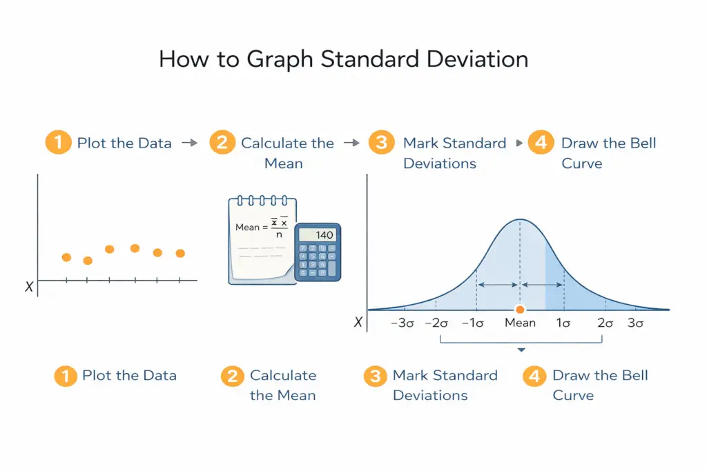
Step 1: Collect Your Data
Start by listing all the values in your data set. Make sure the data is accurate and complete.
Step 2: Calculate the Mean
First, calculate the mean of a data set, then mark it at the center of the graph.
Step 3: Calculate the Standard Deviation
Use the standard deviation formula or a calculator to find how spread out the data is. This value determines the width of the graph.
Step 4: Create the Graph Axes
- The horizontal axis shows the data values
- The vertical axis shows frequency or probability
Mark the mean clearly at the center of the horizontal axis.
Step 5: Plot Standard Deviation Points
From the mean, mark:
- One standard deviation above and below
- Two standard deviations above and below
- Three standard deviations above and below
These points help define the shape of the standard deviation graph.
Step 6: Draw the Curve
Connect the points smoothly to form a bell-shaped curve if the data follows a normal distribution. This completes the standard deviation graphing process.
Following these steps makes it easier to create and understand a standard deviation graph. Next, we will focus on how to create a standard deviation graph using Excel.
Advanced Methods to Draw a Standard Deviation Graph
While basic graphing methods are useful for learning, a spreadsheet or calculator does the arithmetic for you and redraws the chart when the data changes. Use these when the data set is too long to plot by hand.
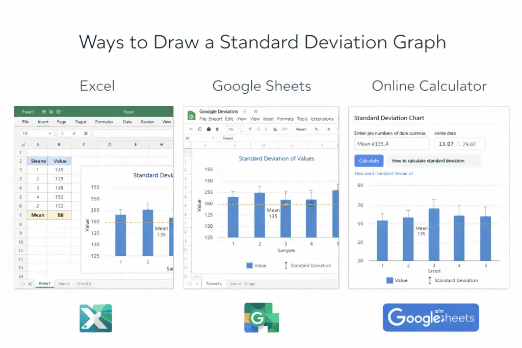
Below are three advanced ways to draw a standard deviation graph step by step.
1. Draw a Standard Deviation Graph Using Excel
Excel is one of the most widely used tools for creating a standard deviation chart because it automates calculations and graphing.
Step by Step Method
- Enter your data values into a single column
- Calculate the mean using
=AVERAGE(A1:A10) - Calculate standard deviation using
=STDEV.S(A1:A10)for sample data=STDEV.P(A1:A10)for population data
- Select your data and insert a line or column chart
- Click on the chart and enable Error Bars
- Choose Standard Deviation as the error bar option
Excel then displays the standard deviation on the graph.
2. Draw a Standard Deviation Graph Using Google Sheets
Google Sheets works similarly to Excel and is ideal for cloud-based collaboration.
Step by Step Method
- Enter your data into a column
- Calculate the mean using
=AVERAGE(A1:A10) - Calculate standard deviation using
=STDEV(A1:A10) - Select the data and click Insert, then Chart
- Choose a line or column chart
- Open Chart Editor and enable error bars
- Set error bars to use standard deviation
Google Sheets draws the standard deviation graph and updates it when the data changes.
Draw a Standard Deviation Graph Using Standard Deviation Calculator
An online standard deviation calculator is the fastest way to generate results without manual formulas.
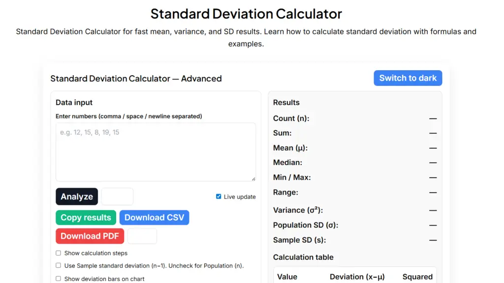
Step by Step Method
- Enter your data values into the calculator
- Click the calculate button
- View the calculated mean and standard deviation
- Analyze the automatically generated standard deviation graph
Use it when you want a quick check and do not want to set up a spreadsheet. It also helps prevent formula errors.
How to Create a Standard Deviation Graph in Excel Explained
Excel is a popular tool for creating standard deviation charts because it handles calculations and graphing quickly. You can use Excel to calculate standard deviation and then display it visually on a graph.
Step 1: Enter Your Data
Open Excel and enter your data values into a single column. Make sure there are no empty cells in the data range.
Step 2: Calculate the Mean
Click on an empty cell and enter the formula: =AVERAGE(A1:A10)
Replace the range with your actual data cells.
Step 3: Calculate the Standard Deviation
Use one of the following formulas:
=STDEV.S(A1:A10)for sample data=STDEV.P(A1:A10)for population data
Excel will return the standard deviation value.
Step 4: Create the Base Chart
Select your data, then go to the Insert tab and choose a suitable chart, such as a line chart or column chart. This forms the base of your standard deviation chart.
Step 5: Add Standard Deviation to the Chart
- Click on the chart
- Go to Chart Elements
- Select Error Bars
- Choose Standard Deviation
Excel will automatically add standard deviation lines to your graph.
Step 6: Adjust the Chart for Clarity
Label the axes, highlight the mean, and make sure the chart is easy to read. A clean layout improves understanding of the standard deviation of a graph.
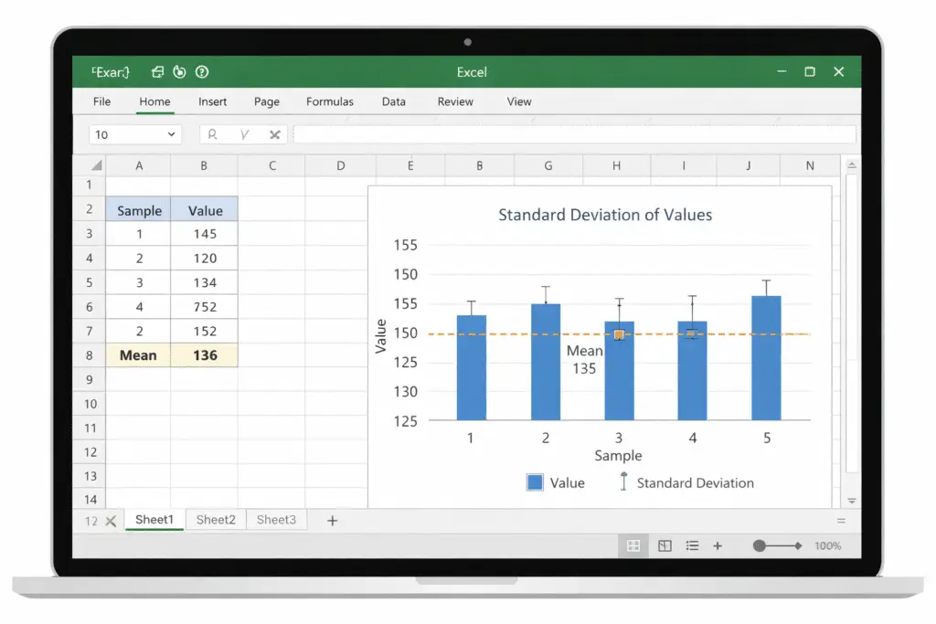
Excel handles the arithmetic for you, which matters most on large data sets.
Common Mistakes When Reading Standard Deviation Graphs
Even though a standard deviation graph looks simple, many readers misunderstand what it shows. Avoiding these common mistakes will help you read standard deviation charts more accurately.
Confusing the Mean with Standard Deviation
The mean is the center of the graph, while standard deviation measures how spread out the data is. A tall curve does not always mean a small standard deviation.
Assuming All Graphs Are Normal Distributions
Not every standard deviation graph follows a perfect bell shape. Some data sets are skewed, which affects how standard deviation should be interpreted.
Ignoring the Graph Scale
Always check the horizontal axis values. A wider scale can make the standard deviation appear larger or smaller than it actually is.
Misreading Standard Deviation Bands
One standard deviation does not include all data points. About most values fall close to the mean, but some lie further away.
Comparing Graphs Without Checking Units
Two standard deviation charts may look similar but use different units or ranges. Always confirm units before drawing conclusions.
Conclusion
Understanding how to read a standard deviation graph makes it much easier to analyze data and compare variability. A standard deviation chart shows how values are distributed around the mean and helps identify whether data is tightly grouped or widely spread.
Knowing how to graph standard deviation and create charts in Excel also allows you to visualize data more effectively.
If you would rather not calculate by hand, the standard deviation calculator does the same steps.
Frequently Asked Questions (FAQs)
-
How do you calculate standard deviation from a normal distribution graph?
To calculate standard deviation from a normal distribution graph, first locate the mean at the center of the curve. Then identify a point where the curve noticeably changes slope on one side. Measure the distance from the mean to that point using the horizontal axis scale. This distance represents one standard deviation.
-
How do you graph standard deviation?
To graph standard deviation, start by calculating the mean of the data set. Next, calculate the standard deviation value. Mark the mean on the graph and then plot points one, two, and three standard deviations above and below the mean. Finally, draw the curve or add error bars to visualize data spread.
-
How do you put standard deviation on an Excel graph?
In Excel, select your data and insert a chart. Click on the chart, open Chart Elements, and enable Error Bars. Choose the Standard Deviation option, and Excel will automatically add standard deviation lines to the graph.
-
How do you create a standard deviation graph in Excel?
To create a standard deviation graph in Excel, enter your data into a column and calculate the mean using the AVERAGE function. Then calculate standard deviation using
STDEV.SorSTDEV.P. Insert a chart and add standard deviation error bars to display variability visually.