

Pie Chart Maker
Add your slices in the tool above, type your labels and values, and the chart updates live as you type. Turn on donut mode for a ring chart, toggle percentages on the legend, then download it as a PNG or export your data to CSV. No account or software needed.
This pie chart generator handles everything from a quick three-slice budget breakdown to a detailed survey with dozens of categories. It works the same on your phone, tablet, or desktop.
What Is a Pie Chart?
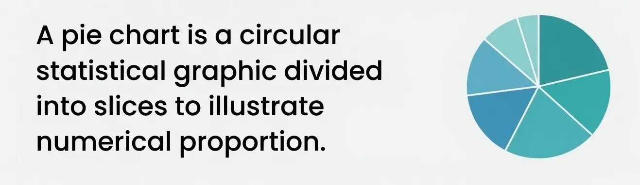
A pie chart is a circular graph split into slices, where each slice shows a part of the whole. The size of each slice matches its share of the total, so a category worth half your data fills half the circle. Pie charts are best for showing proportions and percentages at a glance, like how a budget splits across categories or how a market divides between competitors.
Common uses include:
- Business reports
- School projects
- Financial breakdowns
- Market share visualization
- Surveys & data analysis
How to Make a Pie Chart
Making a pie chart with this tool takes three steps.
- Add your labels. Type a name for each category, like Rent, Food, or Savings.
- Enter your values. Put in the number for each one. The generator turns your values into percentages automatically.
- Customize and download. Pick colors, toggle percentages, switch to a donut if you want, then download your chart as a PNG.
The chart redraws the moment you change anything, so you see the result as you build it. Drag the handle next to any slice to reorder it.
How Are Pie Chart Percentages Calculated?
Each slice's percentage is its value divided by the total of all values, times 100. If your slices are 40, 25, and 35, the total is 100, so they become 40%, 25%, and 35%. If your numbers do not add up to 100, the tool still converts them correctly. Values of 30, 30, and 60 total 120, which becomes 25%, 25%, and 50%. This generator does the math for you and shows the percentage on every slice and in the legend.
| Category | Value | Percentage | Slice Angle |
|---|---|---|---|
| A | 40 | 40% | 144° |
| B | 25 | 25% | 90° |
| C | 35 | 35% | 126° |
| Total | 100 | 100% | 360° |
The slice angle is the percentage times 360 degrees. A 25% slice takes up 90 degrees, a quarter of the circle. This is the same math a protractor-and-compass pie chart uses by hand.
Pie Chart or Donut Chart?
A donut chart is a pie chart with the center removed. The slices and percentages are identical, so the choice is about style. Donut charts leave room in the middle for a total or a title, and the ring shape makes the slice lengths easier to compare. Turn on the Donut chart option in the tool to switch between them, and the center shows your total automatically.
When to Use a Pie Chart (and When Not To)
Pie charts shine when you want to show parts of a single whole. They struggle when you have too many categories or when the slices are close in size, because the eye cannot compare similar angles well.
| Use a Pie Chart For | Use a Different Chart For |
|---|---|
| Budget breakdowns | Comparing values over time (line chart) |
| Market share | Ranking many items (bar chart) |
| Survey results with a few options | Showing relationships between two variables (scatter plot) |
| Expense categories | Data with more than 6 or 7 slices |
If you want to see how two variables relate rather than how one whole divides, a scatter plot maker is the better fit.
Common Uses for a Pie Chart
- Monthly budget and expense breakdowns
- Market share between companies or products
- Survey and poll results
- Website traffic sources
- Exam or grade distributions
- Time spent across activities
Pie Chart Mistakes to Avoid
- Too many slices. Past six or seven categories, the chart gets cluttered. Group small ones into an "Other" slice.
- Similar colors. Slices that look alike are hard to tell apart. Use contrasting colors.
- Slices that do not add up. A pie chart should represent a full whole. Make sure every part is counted.
- 3D pie charts. The tilt distorts the angles and makes slices look bigger or smaller than they are. Stick to flat 2D.
- Long labels on slices. Keep labels short and let the legend carry the detail.
Other Ways to Make a Pie Chart
You can also build a pie chart in Excel, Google Sheets, or PowerPoint. In each one, enter your labels and values in two columns, select the data, then insert a pie chart from the chart menu. These work well when your data already lives in a spreadsheet, but they take more steps and require the software. This online generator is faster for a one-off chart you just want to make and download.
Why Use This Pie Chart Maker?
- Free, with no account or sign up
- Live preview that updates as you type
- Pie and donut chart modes
- Automatic percentage calculation
- Custom colors for every slice
- Download as PNG, or export data to CSV and JSON
- Works on mobile, tablet, and desktop
Try these next
Frequently Asked Questions
How do I make a pie chart online?
Type your labels and values in the tool above. Set the colors, pick pie or donut, then click Download PNG.
How do I make a pie chart with percentages?
Just enter your values. The percentage appears on each slice and in the legend, and you can toggle it off.
What is the difference between a pie chart and a donut chart?
Same slices, same percentages. The donut leaves space in the middle, which this tool fills with your total. Use the Donut chart toggle to switch.
How do I calculate the angle of a pie chart slice?
Multiply the slice's percentage by 360 degrees, so a 25% slice is 90 degrees. The formula is angle = (value ÷ total) × 360.
Can I download my pie chart?
Yes. Click Download PNG to save the chart as an image you can drop into a report, slide, or document. You can also export the underlying data as a CSV or copy it as JSON.
How many slices can a pie chart have?
Technically many, but keep it to six or seven. Past that the slices get too thin to compare.